The 5 Things Overlooked in Multi-Generational Church Space Design
Full CircleWith so many moving parts and pieces to the modern church service, it's easy to miss important details that impact the experiences of guests. Read to learn more about the Five Things Overlooked in Multi-Generational Church Space Design.
Five things overlooked in multi-generational church space design
As easy as it may seem, church space design is complicated. One of the biggest challenges is the need for today’s church to be multi-generational. How do you balance the needs of those long-time members, who have become pillars to its existence, while attracting the younger or unchurched generations? How does the design of a new build or a renovation affect the unchurched and does the design have anything to do with their resistance or attraction to the church? When you factor in demographic segmentation, cultural differences, and community expectations, it’s a complex problem to solve.
Based on what we have seen in thousands of multi-generational church spaces over the last 20 years, here is a list of the five things that get overlooked most often in church space design.
1. Experience & Environment
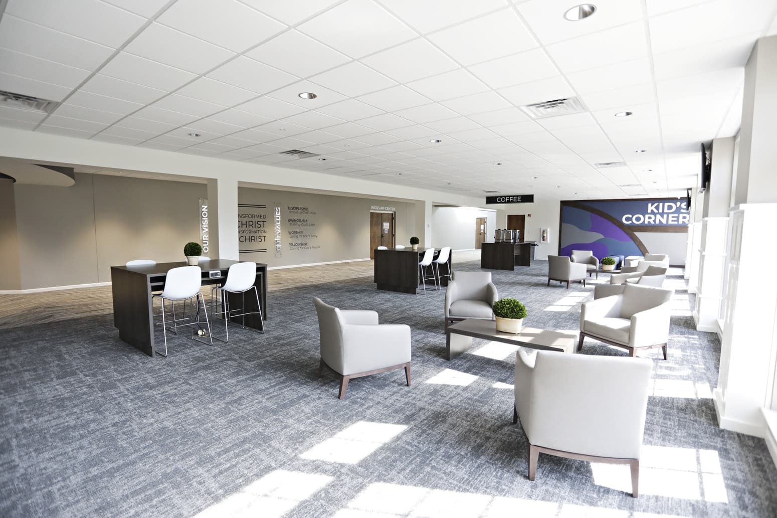
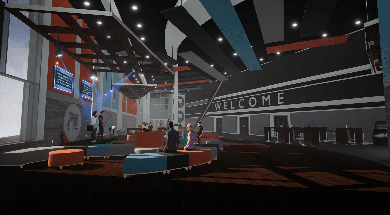
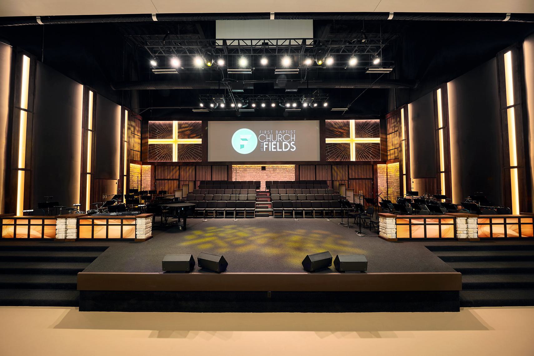
The design should start with the end-user in mind. What do we want them to experience when they worship in this space? How will the environment enhance or detract from their ability to worship? Too many times the focus is on a formula for how many people can fit in a designated space. If we intend to create engagement between the stage and the seat, then our focus needs to be on the elements that enhance the listener’s experience. If we are trying to build community, then we need to intentionally design margin space where connections can occur, and relationships are developed. Through exhaustive programming and needs assessment, we must determine what the right experience is for each particular church and each specific space and let that drive every design decision. This is not always obvious up front but it’s obvious when it's missed.
2. Acoustics
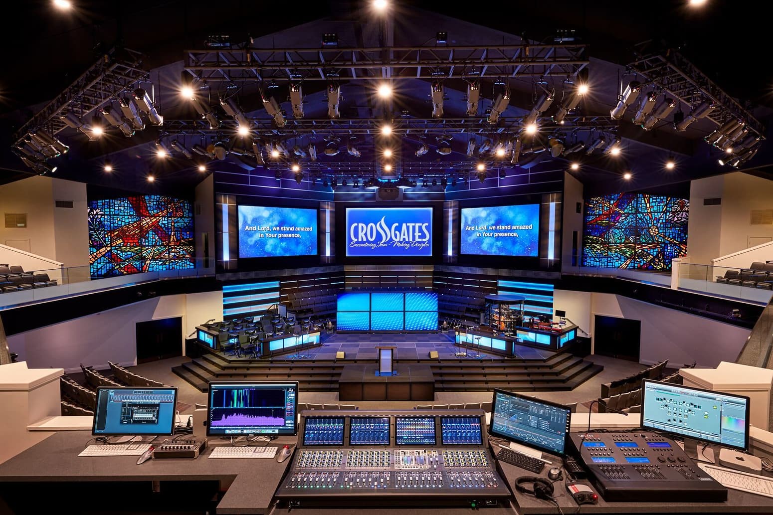
Crowds are noisy. Whether you are putting 1,000 people in a room to worship, 50 kids in a pre-school play area, or 25 people in a coffee shop, none of them will have a great experience if they have to shout to be heard or plug their ears just to hear themselves think. Acoustical treatment often gets overlooked by architects who don’t fully understand the science necessary to create a pleasing experience. Flooring, glass, ceilings, interior furnishings, and walls, all have a significant impact on the acoustical environment. Acoustics itself will have a very big impact on the intimacy and comfortableness of the environment. Today some very pleasing acoustical solutions allow you to add to the aesthetic appeal as well as help solve acoustical issues. Don’t miss this critical element in the design of your space.
3. Signage & Wayfinding
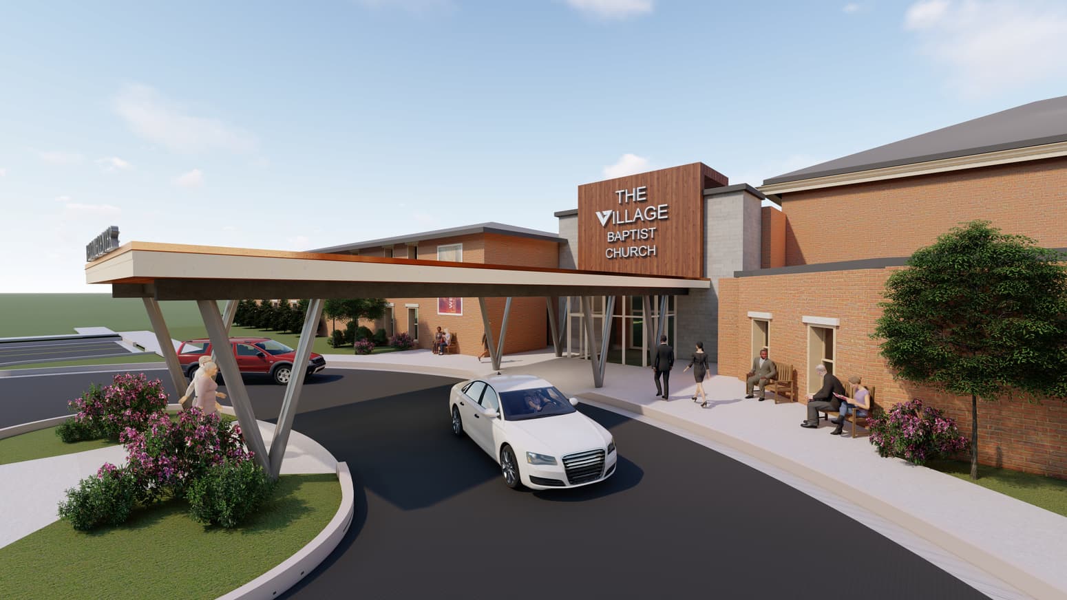
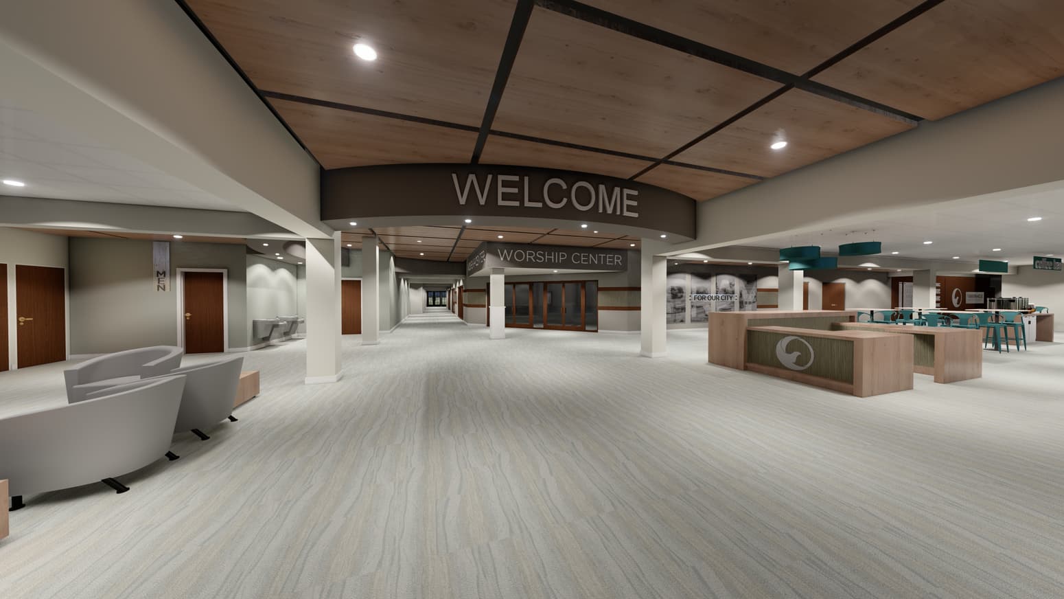
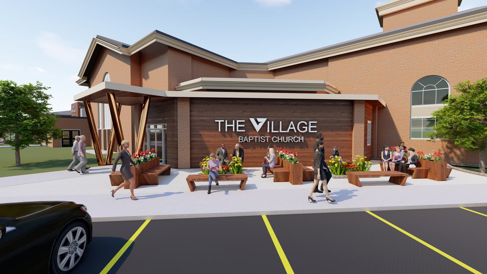
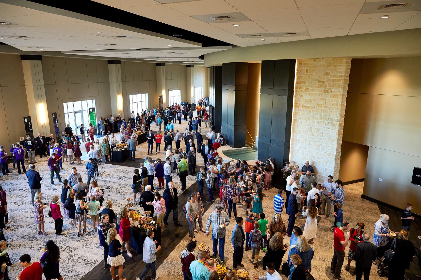
Signage, way-finding, and obvious entrances are critical in the design of church spaces. Nothing is more frustrating to first-time guests than not knowing where to go. It's very common for churches to have many doors with no clear main entrance. Guests do not want to wander aimlessly through your building wondering if they’re in the right place or heading in the right direction. No one likes to feel lost. When developing a signage plan, your goal should be to make it obvious and make it easy for your guests to get to their desired location as quickly and effortlessly as possible. The most embarrassing thing for a first-time guest is to make them go ask directions. Done right, signage has a significant impact on the appeal of your church.
4. Hallways
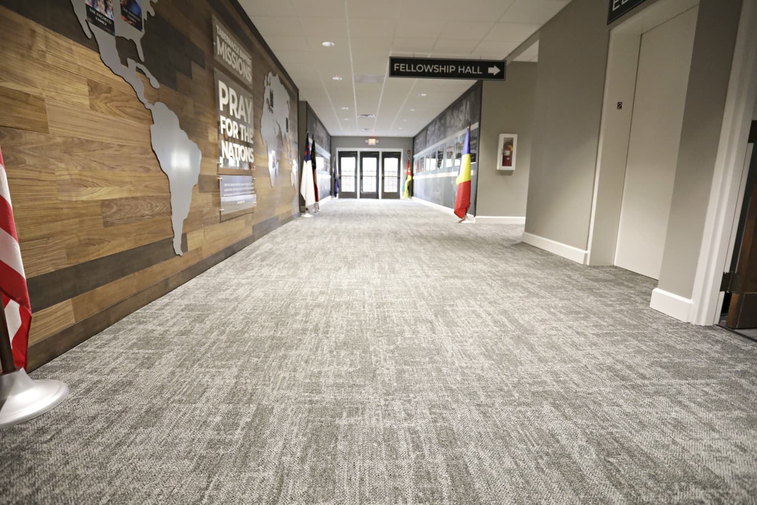
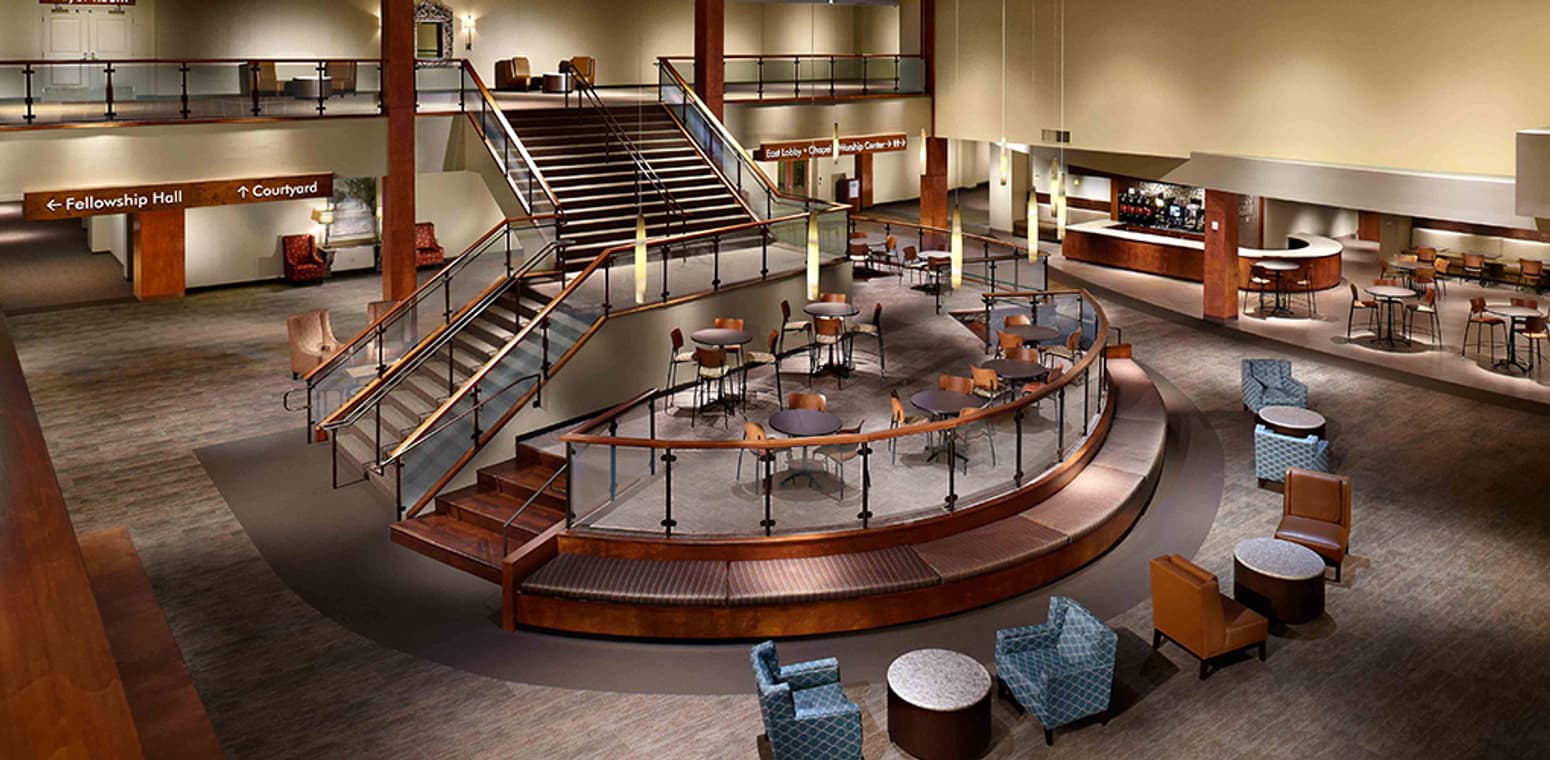
Too often, foyers and hallways are overlooked as part of the experience. Instead of building a community, they actually serve to direct people right out of the building and back to their cars. Over the last several years, churches have begun to focus more on connection, community, and relationships. That’s part of how we grow churches. And yet, our hallways are working against the things we value most. Narrow, noisy, and cluttered hallways do not create the kind of experience that fosters community. In fact, they create a tension that makes people want to get out of there as quickly as possible. With proper design, furnishings, ceiling treatments, and lighting, we can often make existing hallways feel much more inviting to guests.
5. Branding
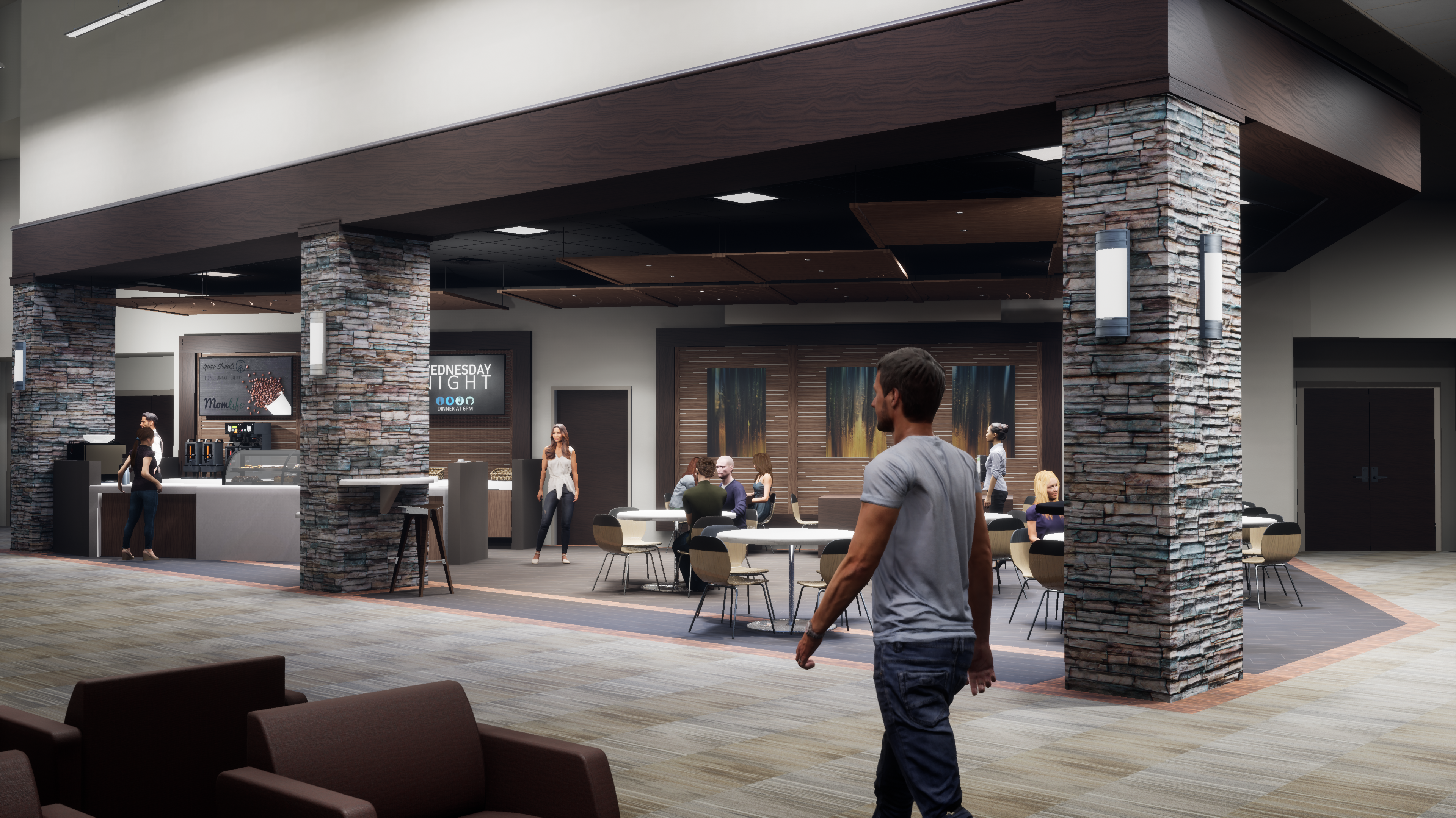
A brand establishes your church within your community, conveys your purpose, increases awareness, and reminds others daily of your mission. It’s more than a logo, slogan, and some wording. It’s a visual identity and a brand promise. Churches have started spending more time working on their branding just like successful corporations do. What is your church brand? Why is it important? How is that tied to your mission? These are vitally important questions for a church to answer. Once that brand is determined, it is also vitally important that we see that brand throughout the design of the church spaces. Attention to branding should be part of the design of each space throughout the church. It should weave its way through the fabric of the design from interior finishes, signage, way-finding, and color palates.
Church design is complicated. Especially renovations of spaces where there are limitations. At the end of the day, the design of church spaces needs to be very purpose-driven and intentional. Our spaces should reflect, at a minimum, a commitment to excellence, a place for authentic community, a lifestyle of worship, and purposeful discipleship. They should welcome a multi-generational people group from all walks of life. They should offer connectivity, excitement, a sense of belonging, encourage relationships, and remove facility barriers. After all, our goal is to keep them coming back for more... and bringing their friends with them. To discuss how Paragon 360 can help you improve connection and engagement through your church design, get in touch with us.
